
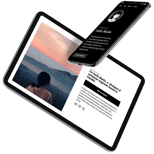
1. Select your favorite designs
Pick a template that you feel will best showcase your content and tell your story. Give it added personality by selecting a base color and font style, and then let our AI customize your site based on your selections.
| Subtotal | $0.00 |


 beta
betaCreate a beautiful personal or small business website in just a few clicks. Whether you want to promote a restaurant, showcase your start-up, or develop a one-page bio site, our website builder will help you every step of the way.
Personal Site Maker
$0.00
$3.88
$38.88
$3.88/mo after 14-day free trial
$38.88/yr after 14-day free trial
Business Site Maker
$0.00
$8.88
$88.88
$8.88/mo after 14-day free trial
$88.88/yr after 14-day free trial
Simple Links
$0.00
$3.88
$38.88
$3.88/mo after 14-day free trial
$38.88/yr after 14-day free trial
No design or coding skills? No problem. Site Maker, our new website builder, is the easiest way to make a website and help build your online presence. Answer a few questions to quickly determine what sections your personal or small business site needs, and our step-by-step process ensures you have all the essential elements in place, as well as fast hosting and website security.
A quick step-by-step guide to help get you online.


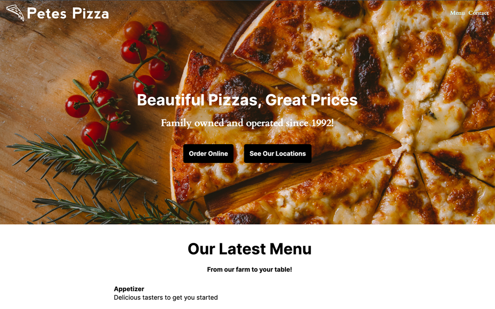
Showcase your work with an online portfolio or share your thoughts by creating an engaging blog. With Site Maker, you can design a website that looks professional and works seamlessly on all devices. Go live in minutes in just a few easy steps.
Pick a template that you feel will best showcase your content and tell your story. Give it added personality by selecting a base color and font style, and then let our AI customize your site based on your selections.

Easily structure your site with blocks. These pre-made blocks make it easy for you to edit and input content, such as contact forms and photo galleries. Play around with different layouts by adding and removing blocks.

Make the site your own by adding your custom content. Then simply add a domain to your site and publish it with just one-click. If you don’t have a domain yet, no problem. You can use a subdomain from Visual.com.
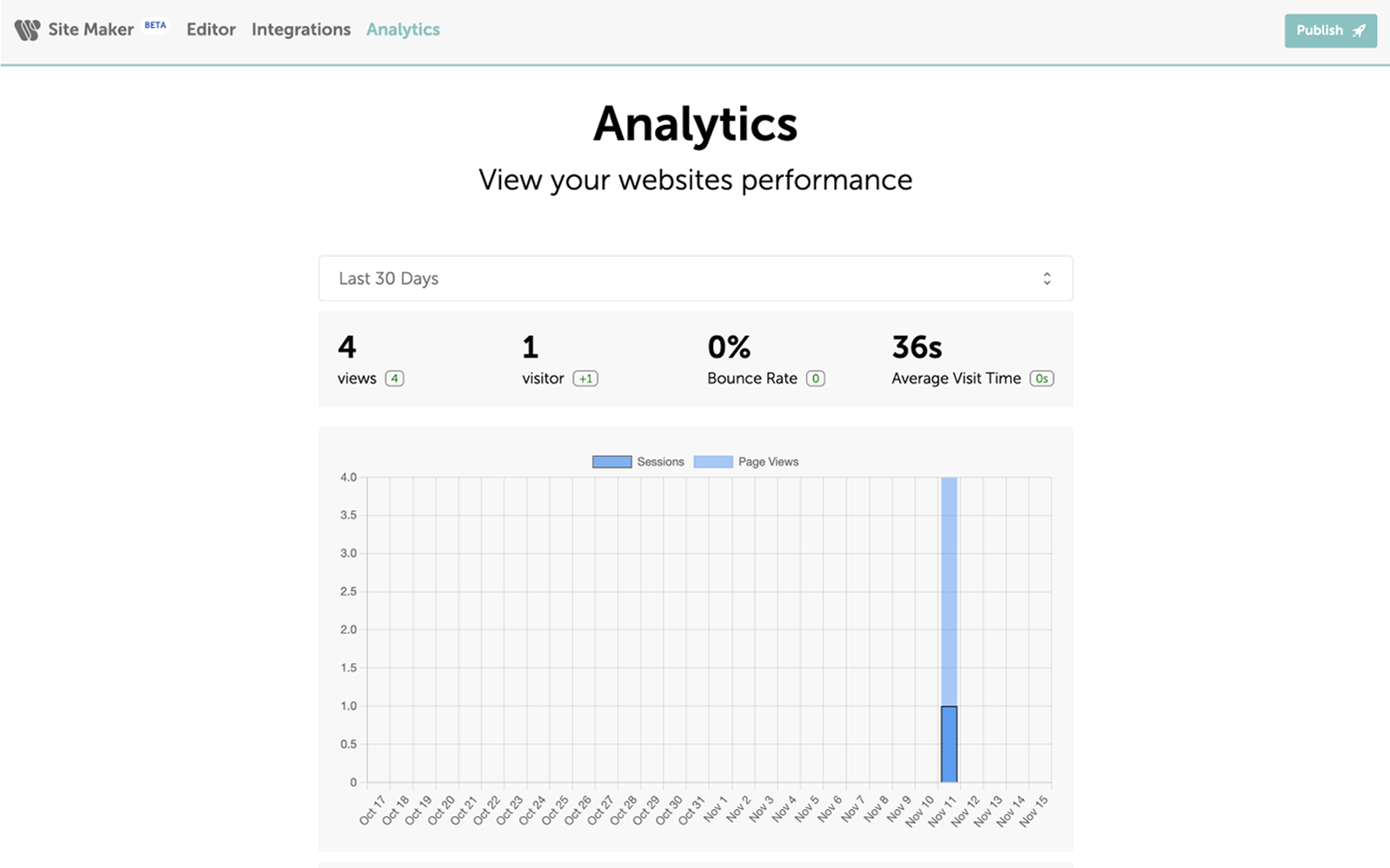
Measure your website’s performance with our intuitive data solution.
Whether you want a small business website, blog, personal site, project site, or online CV, Site Maker is the solution you’ve been waiting for.


With over 14 million domains under its management, Namecheap is one of the world’s largest domain registrars. With millions of names spanning across a variety of different domain extensions, we have a domain for any person, business, or entity looking to have a home on the Internet.

No design experience? No problem. Logo Maker will create the perfect logo for your personal brand or business based on your answers to a few short questions. Creating a logo from start to finish takes just a few short minutes and is completely free.

Card Maker makes it easy for anyone to design and create business cards. Choose from a variety of templates and customize the card with your unique information. And when you’re ready to ship your business cards, get free delivery right to your door.
Read our articles for inspiration and tips on how to create a website.

Site Maker is part of Visual — a suite of creative design tools exclusive to Namecheap.
Visual is a simple and affordable collection of creative tools that helps small businesses, entrepreneurs, and freelancers bring their brands to life. Visual makes it easy for anyone of any skill level to design all the essential elements of their brand. From creating a logo for your business, to building a basic website, to designing business cards, Visual can help bring awareness to any brand. Check out our other Visual tools: Logo Maker, Card Maker, Stencil, and Business Name Generator.


We’re here to assist you with any questions you may have about Site Maker. From its features to the pricing plans, our support team is here to help. Submit a ticket, or better yet, speak to someone immediately with live chat.
Live chat Submit ticketYour website security and privacy comes first at Namecheap, and we will always support the rights of individuals and consumers online. It's our mission to keep the Internet open, free, and safe for everyone.
Boost your business with industry-premium products and services, at prices that won't break your budget. If it doesn't provide you with a better Internet experience, we simply don't offer it.
You're covered by a Support Team that's renowned for being one of the most knowledgeable, friendly, and professional in the business. Real people are ready to assist you with any issue, any time, 24/7.
Site Maker has been designed especially for those with no experience of building a website. The unique build process, and easy-to-use blocks, means anyone can get a site up-and-running in no time.
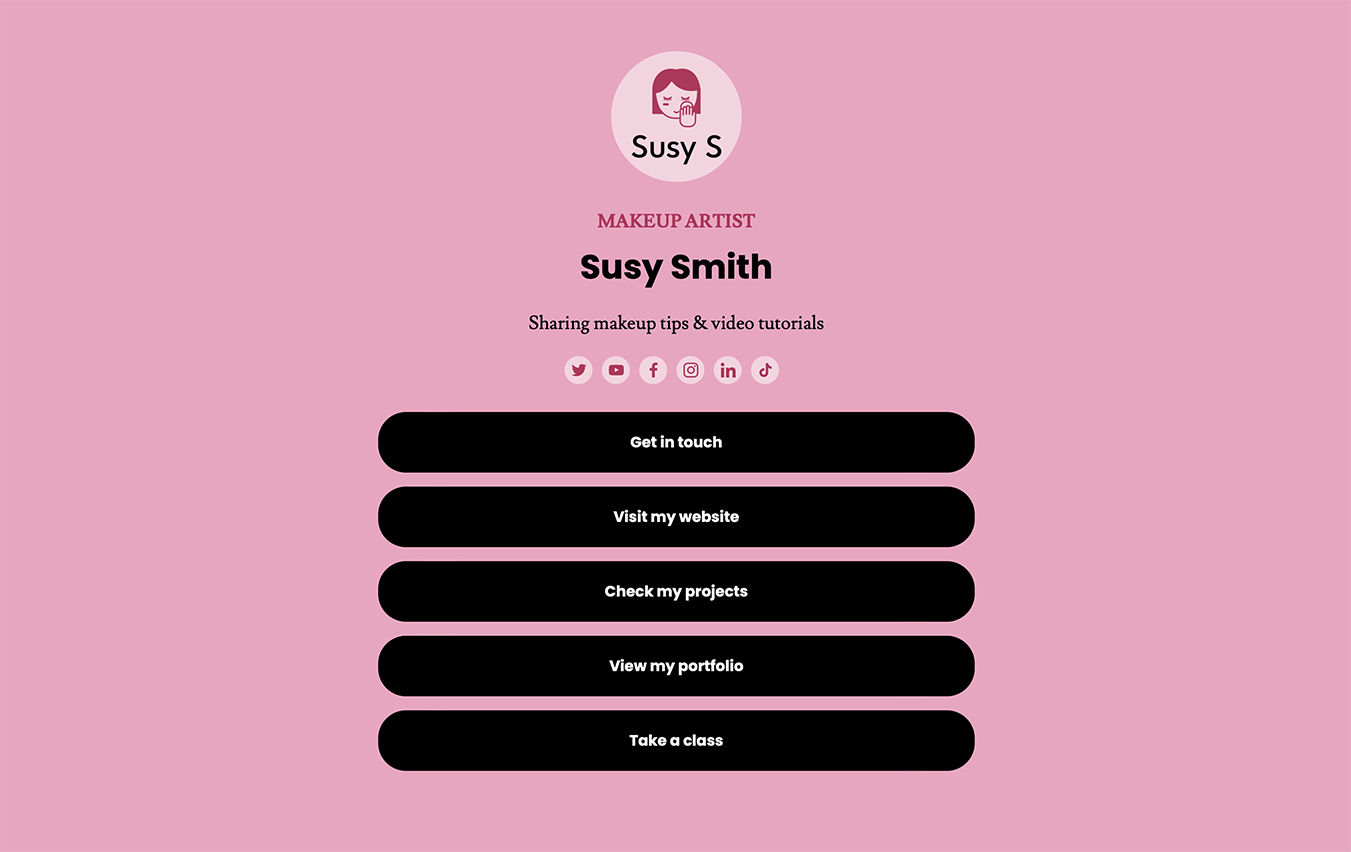
Simple Links is a website builder that allows people to create a basic, one-page site that showcases themselves or their business. Create a microsite that displays key info, like a personal bio, business description, website link, or social media profiles.
You can add up to 12 links and 16 social media icons.
To connect a domain to your Site Maker or Simple Links website, first create your website and then go to the publish page.
Once you’re there, you can see your list of domains in your Namecheap account and select the domain you would like to publish. Once that is finished and you click deploy, Site Maker will configure your DNS records and your website will go live in a matter of moments.
To publish a website, go to the Site Maker or Simple Links application and click on the website you would like to publish, or create a new website.
Once you’re in the editor, make the desired changes to your site, follow any remaining steps, and then click the publish button to get your website live.
Be sure to be logged into your Namecheap account, otherwise you cannot publish your site.
To edit your website, sign in to your Namecheap account and go to the Site Maker or Simple Links app.
Once you’re signed in, select the website you would like to edit and make your necessary changes. When finished, click on the publish button to push your changes live.
To disconnect a domain from Site Maker, you can either go to the records and change the Site Maker CNAME and A record to not point to Site Maker, or you can delete your website which will cancel your subscription and disconnect your Site Maker site.
No, Site Maker and Simple Links is an all-in-one experience, meaning it combines domains, unlimited web hosting, and SSL certificate security into one complete package.
Site Maker and Simple Link comes with a free, built-in SSL certificate which encrypts connections to and from your site, and helps it rank better on search engines. However, Namecheap offers other free, and low-cost security products that may also interest you.
Currently, Site Maker is only for personal websites, so you cannot use it for e-commerce websites.
You cannot build an e-commerce site with Simple Links.
Yes, creating a website with multiple pages is easy with Site Maker.
Yes. Site Maker has a ‘one click import’ option for logos made in Logo Maker, so it’s very easy to add them to your site.
Currently, you cannot import your logo directly from Logo Maker into Simple Links.
Yes. There is a completely free 14-day trial that enables you to try out the tools Site Maker has to offer to see if it meets your requirements.
To cancel your subscription, you will need to disable the auto-renew option for it.
Need help? We're always here for you.


